R&L Quality Painting
Logo Design
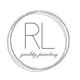
A logo for a residential and commercial family-run painting company, designed to feel elegant and considered while staying true to the craft behind the work. Layered circles that read like paint rings, refined enough to build a brand on.
Logo Design
❋
Brand Identity
❋
Logo Design ❋ Brand Identity ❋
The Brand
R&L Quality Painting is a family-run residential and commercial painting company that wanted a brand identity as polished as the work they deliver. A business built on craft, quality, and the kind of attention to detail that shows up in every job they take on.
The Brief
The ask was clear: create a logo that felt classy and elegant without losing the spirit of what they do. It needed to feel professional enough for commercial clients while still being grounded in the trade. Something that communicated quality before a single word was read.
The Approach
The first instinct was literal, paint cans, brushes, the obvious visual language of the industry. But literal rarely becomes memorable. After several iterations and close collaboration with the client to understand what they truly wanted to convey, the concept evolved into something more considered.
The final mark is a series of overlapping circles, evoking the rings left by a paint can on a surface, with the company name centered inside. Elegant without being precious. Rooted in the craft without spelling it out. The kind of logo that works across a business card, a truck door, and a storefront without losing anything in translation.
What I Learned
This logo was created early in my creative journey, not long after graduating college, before I had formal training in branding, design, or marketing. What I had was curiosity, a willingness to listen, and a client generous enough to trust me with their brand.
That experience taught me something I carry into every project today. A logo is the first thing anyone sees and the first impression a brand makes before a single conversation happens. What it conveys matters, not just aesthetically but strategically. Getting there requires listening closely, iterating honestly, and never settling for the first idea just because it works on the surface.
I am grateful to R&L Quality Painting for being the project that taught me that.
The Outcome
A logo that feels like the brand it represents. Classy, considered, and built to last, just like the work R&L Quality Painting puts into every job.
What Was Delivered
Logo design
Multiple iterations and refinements in collaboration with the client
Final logo files ready for print and digital use
Let’s Work Together!
You do not need to have it all figured out before we talk. Book a free 30 minute consultation here and let's explore what your brand needs, what is possible, and whether we are the right fit for each other.
Prefer to reach out directly first? Send me a note at tiff.kwok@daydreamswithtiff.com and we can go from there.